The Psychology of Colour
What is colour psychology?
Colour psychology is the study of colour’s impact on human behavior. It aims to understand why and how different hues affect our feelings, behavior and decision-making processes. It’s used in many fields, from branding and marketing, to interior design, art and more, in an attempt to use color optimally to reach a certain goal.
In the world of digital user experience and button design, are you more inclined to click on a green button or a red one? Did colour play a part in the last item of clothing you purchased? Are you able to sleep in a room painted in a vibrant purple hue? Do you naturally gravitate towards one particular brand because of their logo or brand colours?
It’s true that answers may differ from person to person, depending on factors like culture, upbringing, location, age and more. However, some colour meanings are more universal. For example, we naturally relate warm colors like red, orange and yellow to warmth and sunshine, whereas cool colors like blue, green and purple tend to be calming and refreshing. In marketing and branding, particularly online, there has been a lot of research into which colours are more likely to influence a desired behaviour in a customer. Red screams SALE or DEAL, Buy Now or even Warning. Green suggests clean, fresh and natural.
The importance of colour psychology in marketing
As colours have such a strong influence on our emotions, they can be used wisely in marketing to convey a specific message to the audience and shape the way a brand is perceived. Implementing the right colour scheme is essential in building a distinct brand identity that sets the tone and personality of a company. This thinking also applies to a business’s marketing assets, from the logo design to the website, and any other visual content and printed materials.
When picking the right hues to reflect your brand, you can of course use an online color palette generator. But without a solid understanding of color psychology and how colors can be used to evoke emotions, you’ll have a tough time making the best choice.
Let’s take an ice cream or confectionery brand as an example. You’d imagine their online store’s colour palette to be playful, full of either pastel or bright and joyful shades. A dark storefront would set a completely different vibe, possibly suggesting elegance and maturity - an unusual choice for an ice cream brand.
Colour meanings
While each colour can be used in a never-ending range of shades, tints and tones, the psychology of colour offers general guidelines that can help with your palette choices.
Here’s a list of colours and their meanings below for you to consider.
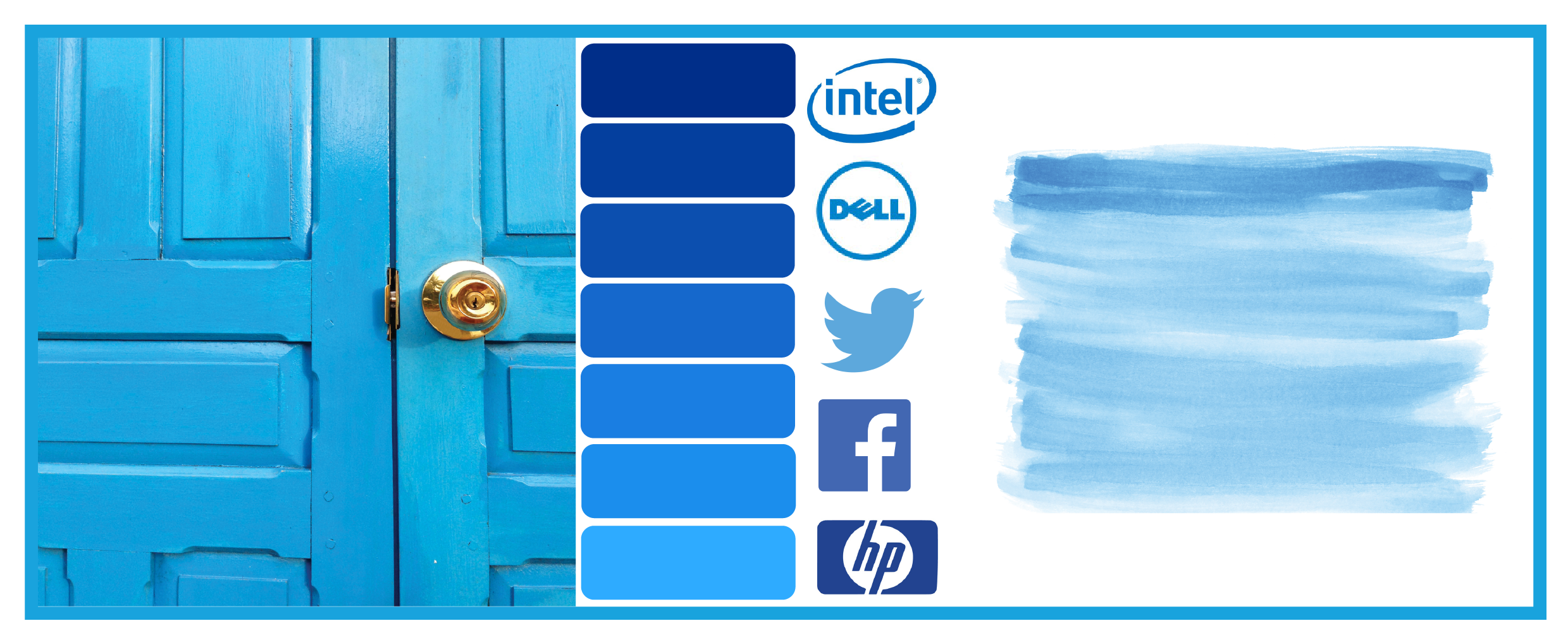
Blue colour psychology
Ranging from teal to navy to indigo and more, the color blue tends to be perceived in different ways depending on the shade. It’s now often used in corporate logos, making its connection to business and especially to the tech industry in certain countries around the world. Social media platforms like Facebook, LinkedIn and Twitter are good examples, as do other high tech companies like IBM and HP.
The reason it’s become so popular amongst corporations could be to do with the fact that blue is generally seen as reflecting loyalty and stability. It’s also often connected to feelings of tranquility, harmony and calmness, reminding us of the sea and sky. In fact, as part of their World’s Favorite Color survey, paper manufacturer G.F Smith found dark blue to be the most relaxing color in the world.
However, blue also has another side to it; it’s often connected to feelings of depression, hence the term “feeling blue.” Throughout art history, it’s been used by various artists, most notably Picasso, to express a somber and negative mood in their works.
Green colour psychology
The color green is widely associated with nature. In colour psychology, it’s also often used to symbolise ecology and sustainability, making it a popular choice among brands that want to position themselves as natural, clean and environmentally friendly. It can also relate to growth and freshness.
For example, Spotify’s use of a vibrant shade of green suggests that the company is full of life and vitality. American supermarket chain Whole Foods also use green, opting for a darker shade that brings across a feeling of the outdoors, suggesting that their products are natural, organic and healthy.

Yellow colour psychology
Yellow is a great colour for capturing attention. Our eyes naturally process it first, making it a smart choice for warning signs, reflective vests, ambulances and more. It’s used for the same purposes in nature. For example, a wasp alerts us of its sting through its yellow and black exterior, as does the yellow banded poison dart frog.
However, as well as symbolising caution, yellow is also very much associated with optimism, sunshine, warmth and energy. These positive associations with yellow are prevalent around the world and among many different cultures. This universal perception of yellow could explain the choice to use yellow for emojis. It’s also used in branding to suggest a fun, happy vibe, for example in Burger King’s logo or McDonald’s’ famous Golden Arches.
More recently, a certain shade of the colour has been popping up. It’s become such a trend that it’s even been coined “gen z yellow,” marking it as a fresh, contemporary color. This specific hue can be found throughout popular culture, from fashion design to music videos, graphic design and more, supposedly taking over from the equally popular millennial pink.

Orange colour psychology
What came first, orange the colour or the fruit? As a colour, orange ranges from dark, earthy tones like terracotta, to more pinkish hues like salmon and coral. Generally the colour is perceived as positive and cheerful, but certain hues also relate to caution, which is why it’s often used for traffic cones and police vests as well as high vis vests in construction etc.
Named after the fruit, the colour orange naturally exudes a sense of freshness and vitality. Falling under the category of warm colours, it also emits a feeling of heat and summer, while its darker tones are often connected to Autumn.
In marketing, orange is often used as a slightly softer alternative to red. It draws attention without being too obtrusive, which is why we can see many call to action examples that make use of the colour.

Red colour psychology
Red is generally seen as an extreme colour - in all its meanings. It holds strong connotations to love, desire and seduction, while on the other hand also being associated with feelings of danger, anger and violence. It also evokes a sense of energy and instantly grabs attention, thanks to its high visibility. This makes it an appropriate colour for warning signals like stop signs and fire engines. In marketing it is often used to demark a sale - “Red Dot” sales by Farmers, Sale etc.
Different cultures around the globe perceive red in diverse ways. For example, in China’s stock markets, the color red is used to symbolise a price increase, whereas the extreme opposite (the stock going down in price) holds true in many other countries. Why? Because red is a lucky colour in Chinese culture, also used for bride’s wedding dresses and to symbolize celebration and fertility.
Red’s bold and powerful presence also makes it the colour of choice for many iconic brands, like Coca-Cola and more recently, Netflix. For Coca-Cola, the colour red conveys a sense of excitement, energy and youth. In Netflix’s case, their decision to go for red text on a black background creates an elegant cinematic feel that builds anticipation and is often found in cinematic brands.

Pink colour psychology
While pink has a long history of being perceived as girly and childish, this stereotype is gradually fading as more non-traditionally feminine brands make use of the colour in their marketing efforts. In colour psychology, pink is often associated with playfulness, fun and lightheartedness. Bright shades of pink like magenta or fuschia stand out, while being less alarming or threatening than the color red.
Perhaps the most well-known brand that uses pink in their visual identity is Barbie - a company strongly associated with all things ‘girly’. Many other businesses targeting women also opt for pink, such as make-up brand Benefit and Victoria’s Secret.
However, we can also spot the recent surge of pink in tech companies. For example, Invision’s logo is a vivid shade of pink, and the same colour is used throughout their branding. The colour has been newly embraced in tech for the feeling of energy, youth and excitement that it brings. The same goes for high tech insurance company Lemonade whose colour scheme is made up of black, white and a striking shade of hot pink.

Purple colour psychology
In colour psychology, the colour purple symbolizes luxury, royalty, nobility and wisdom. It’s also often associated with magic, mystery and the supernatural. This could be due to the fact that purple is a rare colour to spot in nature, making it seem somewhat otherworldly.
Purple is quite an unusual color to find in marketing and isn’t used in many big companies. However, Cadbury has been using it in their logo since the beginning of the 20th century, even attempting to own the right to trademark its specific shade (Pantone 2685C). As purple represents luxury, the use of the color suggests that their products are of a high quality. Since Cadbury, additional chocolate brands have adopted purple too, for example Milka and Nestle.

Black colour psychology
Black has many different color meanings. On the one hand, it is seen as timeless and classic. Think cocktail party, black tie events or the classic “little black dress.” It can evoke elegance, sophistication, power and mystery. But on the other hand, it’s also linked to pessimistic feelings of anger, loneliness and depression, as well as mourning in Western culture and was the colour of choice for many years for funerals.
Black has also caused a stir in the art world, as artist Anish Kapoor acquired exclusive rights to Vantablack - also known as the “blackest black in the world.” The pigment is supposedly so dark that it appears somewhat unreal, absorbing 99.96 percent of light. As a response, artist Stuart Semple developed his own dark pigment, coined Black 2.0.
In marketing, many brands opt for black as their logo’s color of choice. Iconic brands with black logos include Nike, Gucci and Adidas. Black is a clean choice that never goes out of style, it can always be combined with other hues to soften the overall look and feel, making it relatively easy to work with.

White colour psychology
White is widely seen as reflecting innocence, purity, goodness and rebirth. White can symbolise a clean white canvas, or a fresh new beginning. It’s a neutral colour that enables our eyes to rest, which is why it’s widely used in many fields, from interior design to web design (like the generous amount of white space around this blog post).
Additionally, white also gives off a pristine and hygienic feeling. But too much white can create a sense of sterility (picture a dentist’s clinic for example), so unless you’re aiming for a very neutral look, it’s generally recommended to combine it with additional colours and possibly with textures also.
In certain cultures, white relates to death and mourning. In Eastern Asia, white clothing is worn during mourning to symbolize rebirth and purity, whereas in Western culture, a bride typically wears a white dress on her wedding day although this trend has changed over the past two decades.
Gray colour psychology
Being on the scale between black and white, gray is perceived as neutral and balanced. Its lack of color makes it useful, as it can be implemented in cases where many colors are already being used, without causing disruption to the design. Gray can at other times add a sophisticated, modern feel to a well-balanced and contemporary design. Dark gray can also serve as a more toned-down version of black when looking for a less dramatic contrast.
However, gray also has some negative connotations in color psychology. It can appear dull or moody. In design, it’s generally recommended to combine gray with an additional color (be it white, beige or anything else) in order to bring the design to life. Silver is a popular choice from the gray palette for logos and branding as seen in prestigious vehicle manufacturers such as Mercedes-Benz.

Brown colour psychology
While brown is not the most inspirational of colors, it can also be used effectively to create an earthy, natural tone. After all, it’s the colour of wood, sand, mud and many other elements in nature. This can bring people to perceive brown as warm, comforting, safe and reliable. Light, natural shades of brown, like beige and cream, are often used in hygge interior décor to create an atmosphere that is clean and minimalistic, while also feeling warm and cozy.
When it comes to marketing, brown can be used to craft a sense of trust and stability. Consider for example Louis Vuitton who use brown in their visual identity, giving their brand a classic, timeless air. Many chocolate brands like Godiva, M&M’s and Magnum also opt for brown - a natural choice for their product.

So if you are in the process of rebranding or want to give your logo a refresh, look at the psychology behind the colours to help guide you towards the right fit for you and your brand.
If you would like to discuss a logo or branding project please get in touch! We would love to help! Our graphic designers are specialists in choosing a colour palette that fits your brand and evokes the desired emotions from an audience.